03 . Core
Global setting and css required for the entire site
core.layout.css
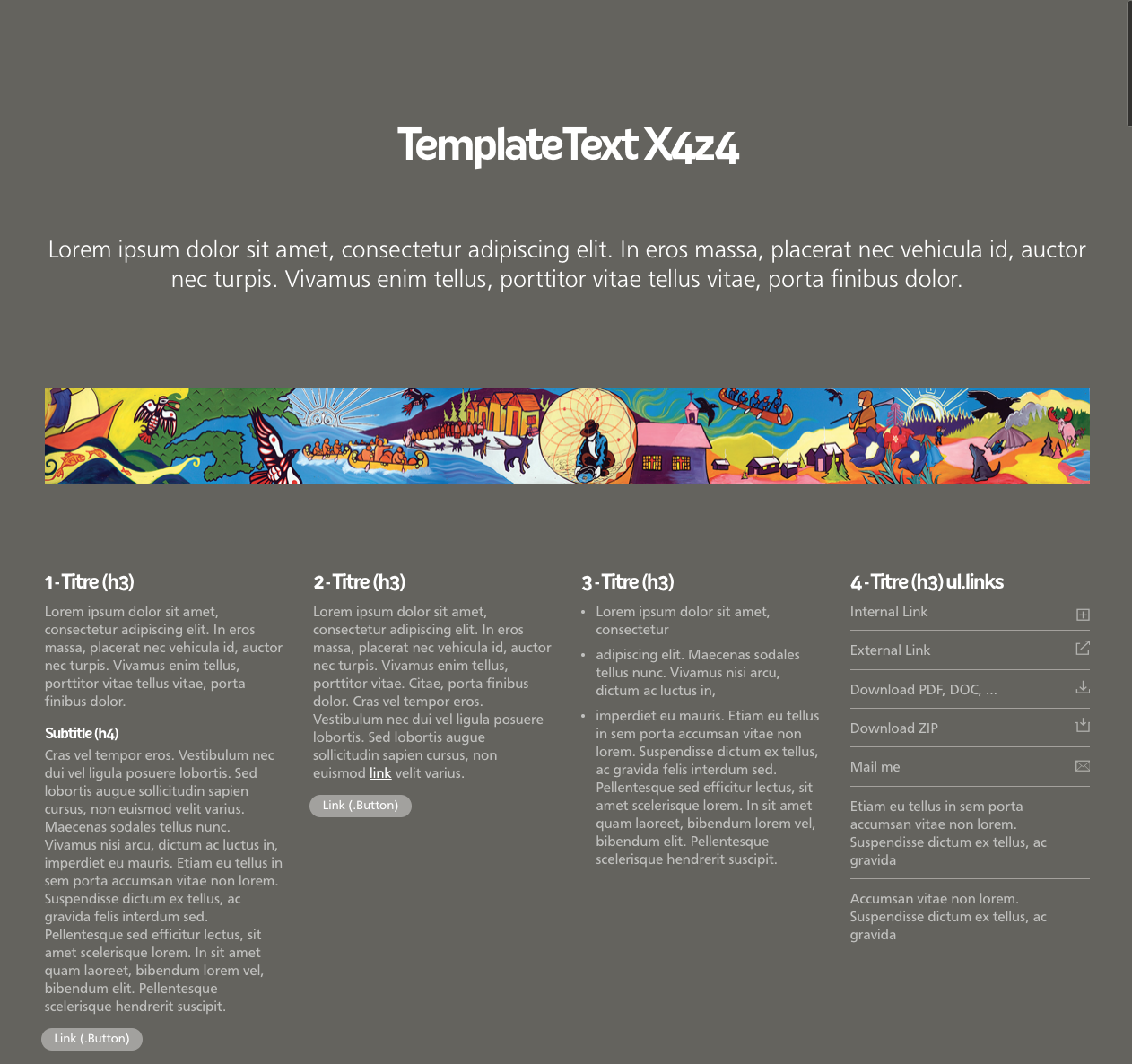
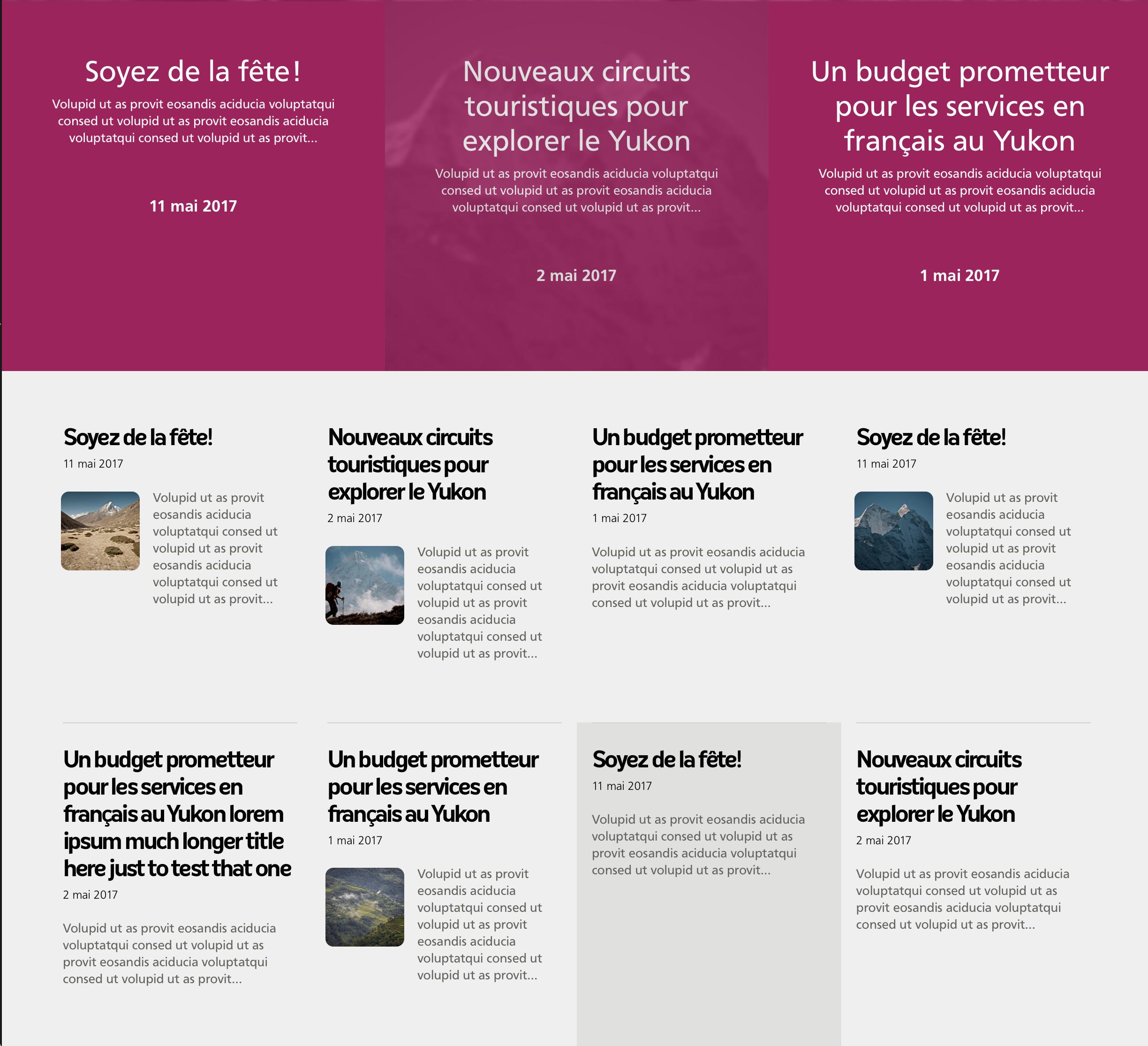
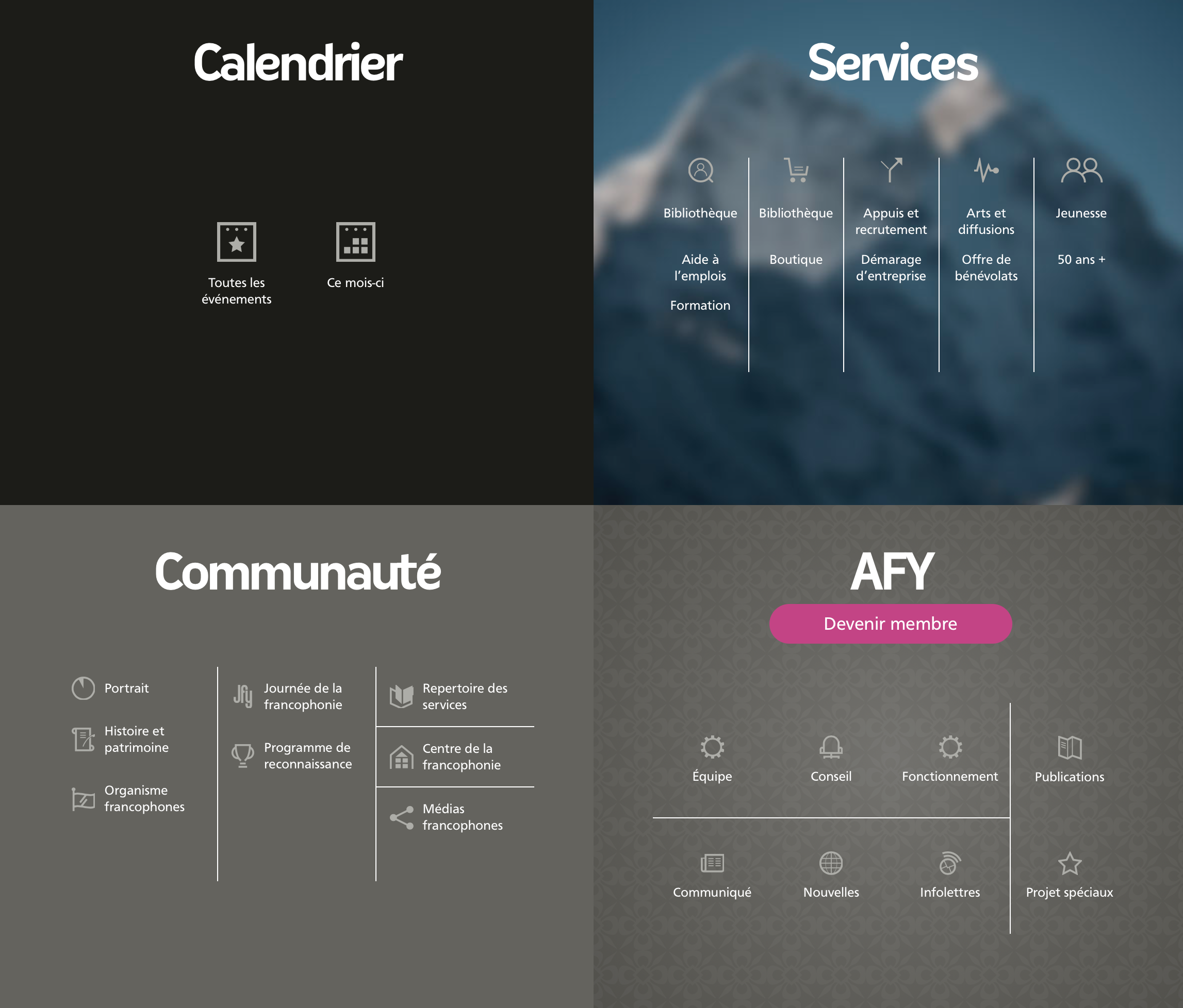
.Band
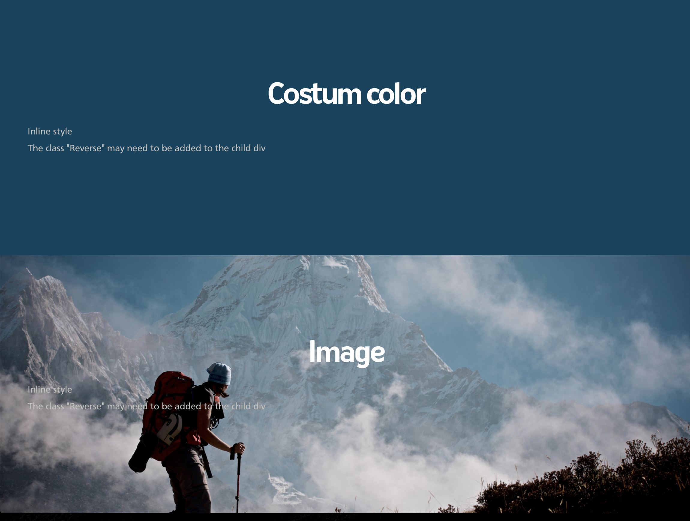
Bands, or rows are full width, alternate in colour and can be customized:
- .White
- .Alt
- .Theme
- Custom Colour (Inline style)
- Custom image (Inline style)
CSS: core.layout.css
.ContentWidth
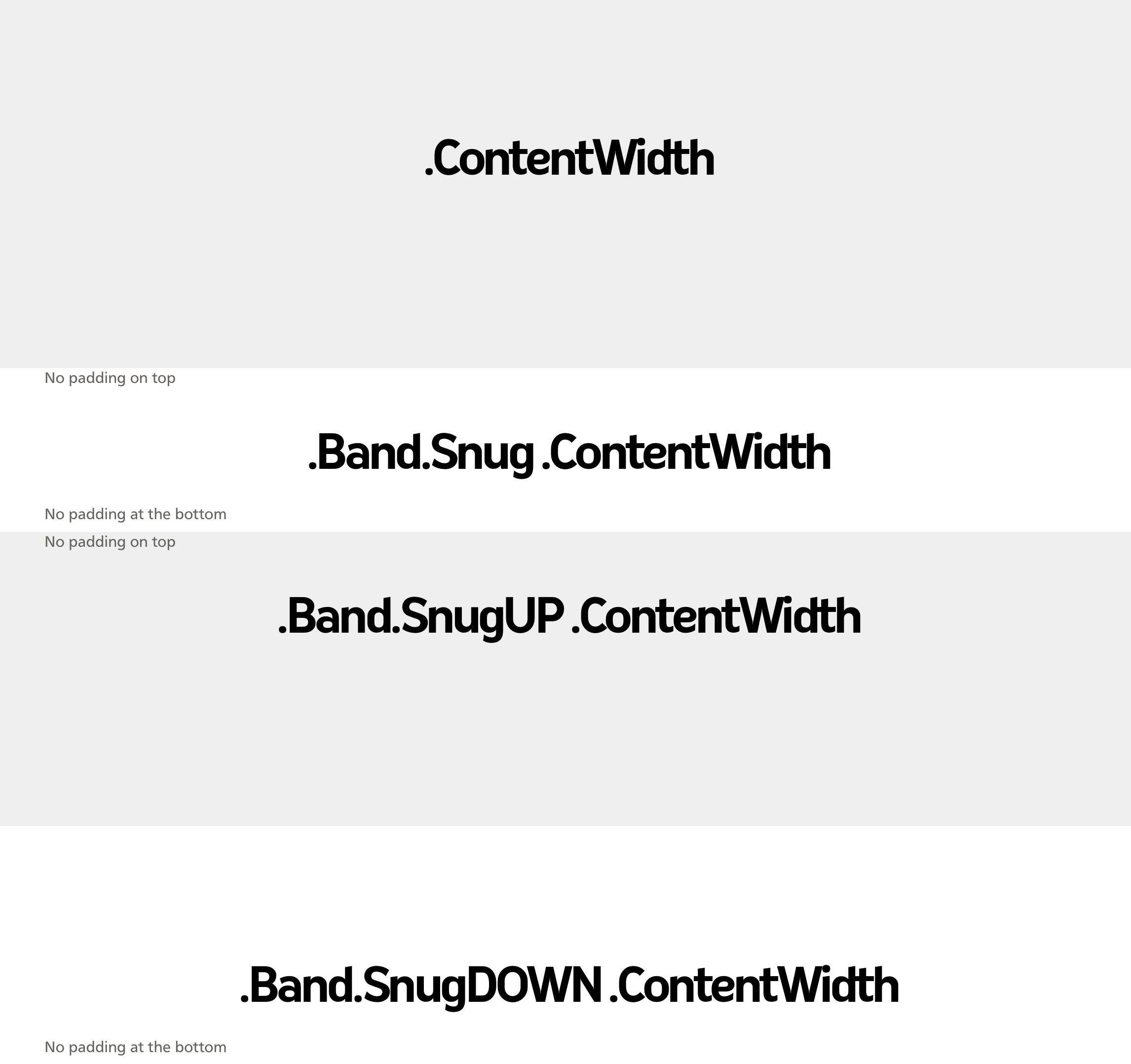
Global setting for the site content width, except for the News and News Release. This also rules padding on top and bottom and can be customized:
- .Snug
- .SnugUP
- .SnugDOWN
- .FullScreen
CSS: core.layout.css
Footer
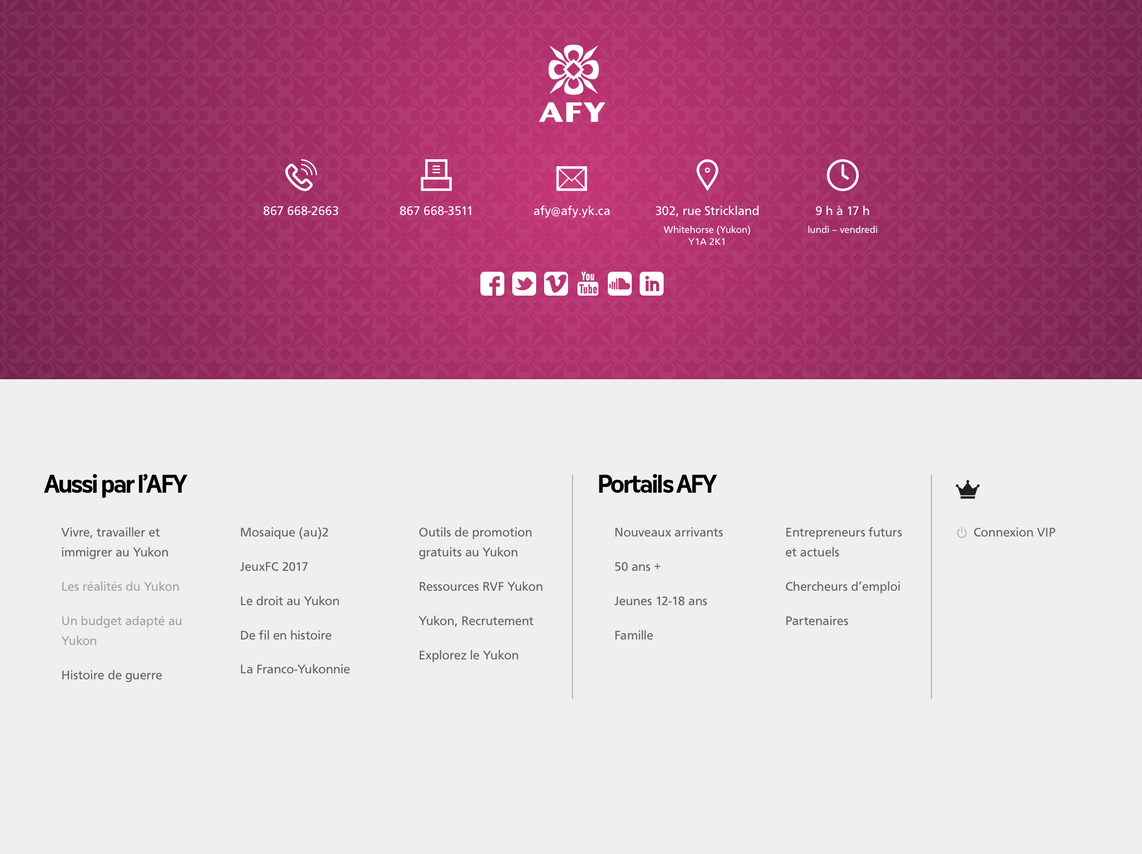
The footer is present at the bottom of all pages and remains constant, except for the Sponsor section which can be customised per page. The default configuration should match the one at the bottom of this page. core.footer.css file must be placed after core.layout.css
- Contact — global
- Also — global, but will evolve
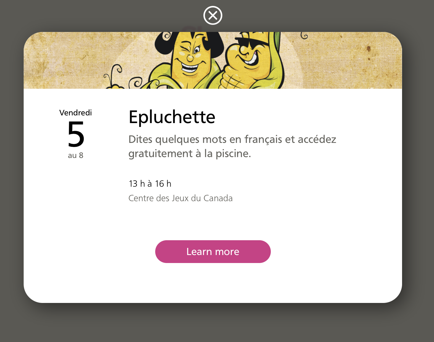
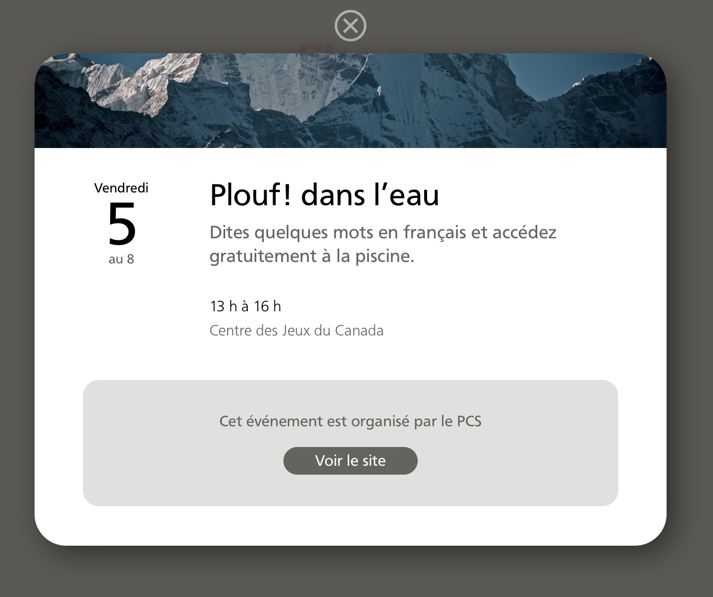
- Sponsors — Global However, a new per page sponsor band (row) is now at the bottom of the Collection and Event pages — it is literally the same band as the one used in the footer. See sample pages using the top navigation.
- Credit — global
CSS: core.footer.css
Typography
Default text formatting, regardless of the layout. Some overriding classes are included to accomodate exceptions:
- .Note
- .Intro
- .Center
- .Rag
CSS: core.typography.css
Buttons
For stand alone buttons and default links colour
CSS: core.buttons.css
font.css
Just the font loader
CSS: font/fonts.css
Language
.EN added to the body tags triggers some language switch in the CSS. i.e. ::Before
Note: The only communality between the English and the French site are the css and js files. Other than that, both sites should be 100% independent. Every object found on the French site is likely to be found on the English site.
jQuery
Some objects and templates use JavaScript. jQuery is required.
